the project.burrwood furniture co.
noun./ bər.wo͝od
A new custom furniture design studio that focuses on utilizing sustainable build practices through repurposing and redesigning old pieces.
duration: twelve weeks in twenty-twenty-one my role: sole ux.ui.visual designer context: course project toolbox: pencil + paper; illustrator; photoshop; xd; figma; aerointroduction.From conception to actualization, burrwood furniture co. is a design studio you want working on your furniture projects.
Working from extensive knowledge on sustainable wood-working practices and design, the small team bridges the gap between mass-produced aesthetic pieces + your grandmother’s hutch.
They make timeless pieces that will be there for your most precious moments in life.

the ask.
To create a brand in all its glory / To create a design process book of the full concept
This included full brand conception [tone, target audience, objective, inspirations, key brand colours, etc.]; logo creation; instagram icon set creation + website design/prototype.
inspiration.

colour theory.

brand thoughts.


logo design process.

thumbnails/linears.
Iterating quickly in this stage allowed me to explore a variety of different font styles, layouts and designs in order to achieve the best possible options to explore in more detail.
finals.
It ultimately came down to this concept. Two versions were created to allow the brand freedom and versatility in relation to brand expression. Whether the logo is being branded on a piece of furniture or displayed on their website - they have options.


mockups.
Seeing the logo in a way that it would naturally exist within the realm of our world was key to communicating the full brand feel + experience.

icon set design process.

thumbnails/linears.
Here the exploration into the overall icon set was explored. Keeping in mind the brand aesthetics and original brand identity as a whole.
The set needed to be visually balanced and have each icon work well together - all while communicating the overall brand tone.
finals.
Both light + dark options are shown in their final designs below, once again allowing burrwood the freedom to ‘switch it up’ depending on the application.


mockups.
Implementing these design within instagram itself allowed me to confirm the designs are scaleable and appropriate for the intended application.

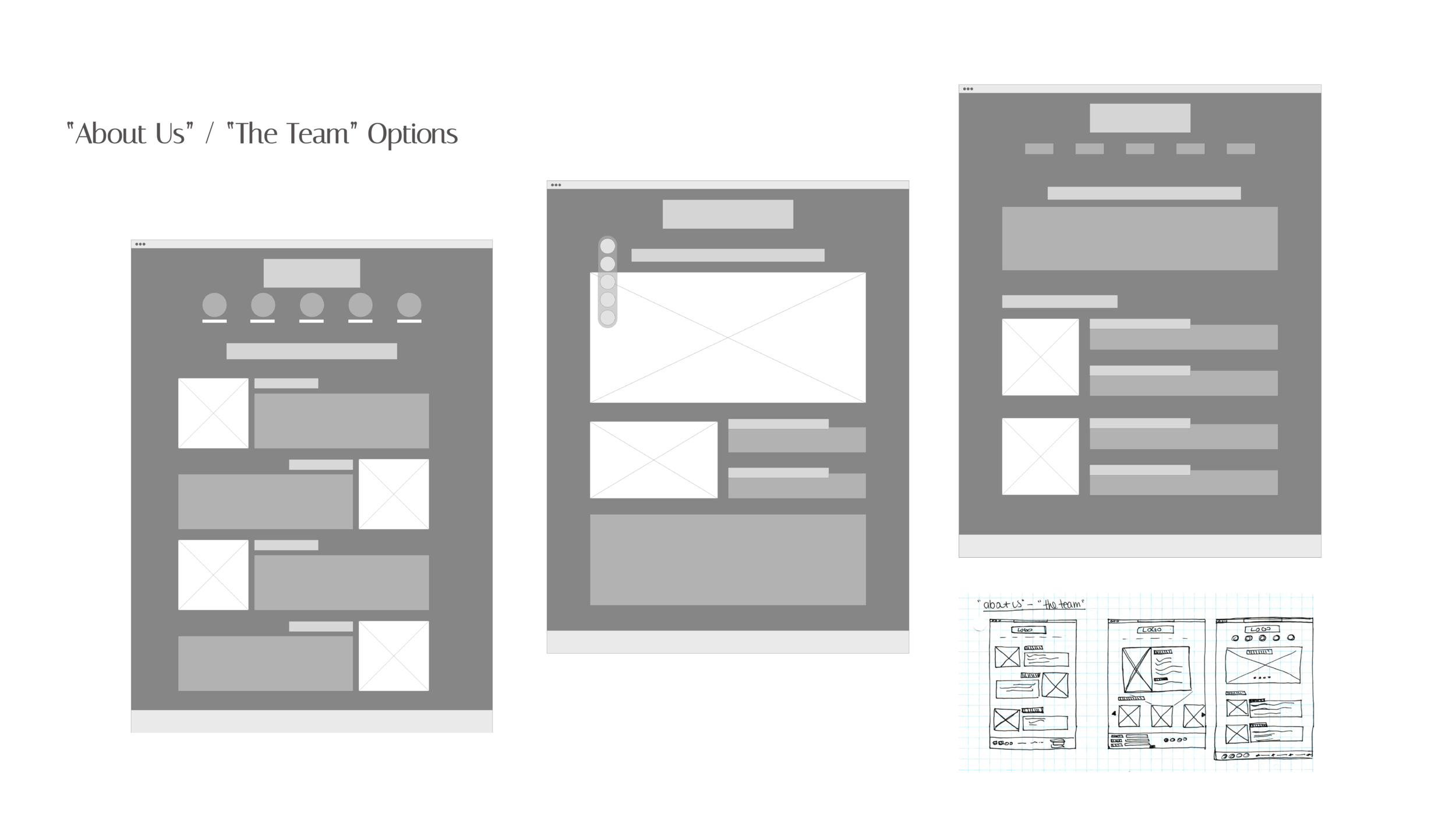
website design process.
low fidelity desktop.
Starting with hand-sketched wireframes, then taking them digital facilitates fast iteration, allowing for more creative exploration - make mistakes early and often.


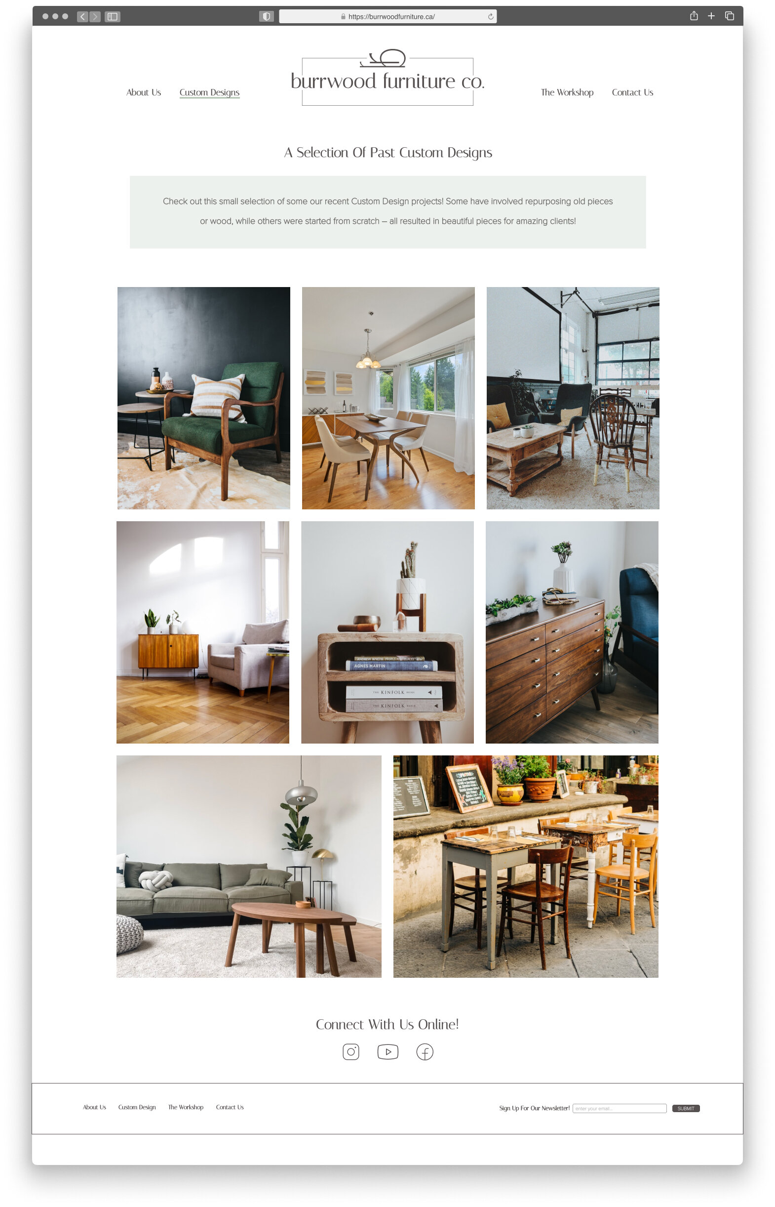
responsive high-fidelity mockups.

desktop.
Maintaining a simple, well-organized website was important to be able to have the furniture pieces themselves speak to the brand.
No distractions - let the images breathe.

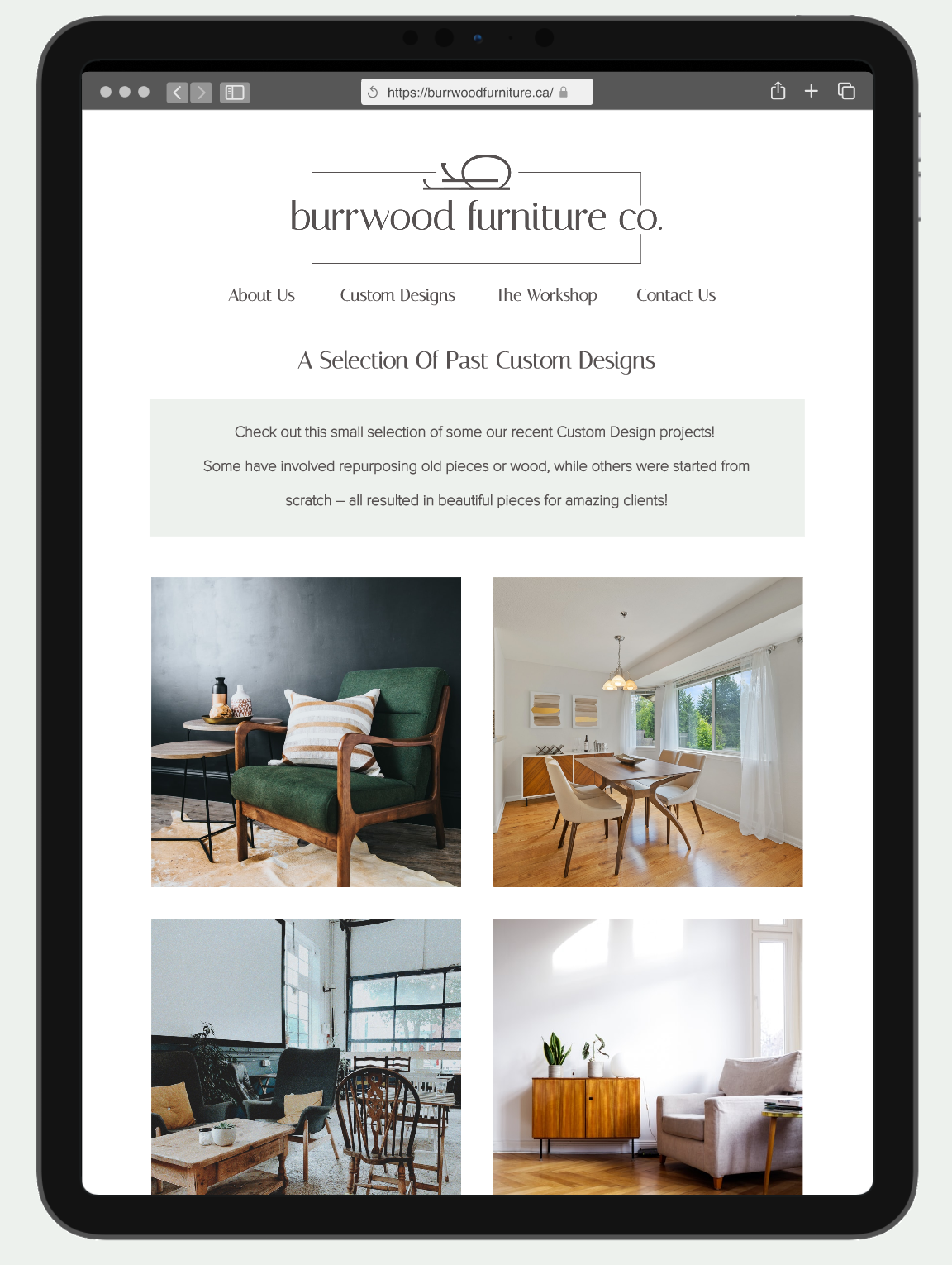
tablet.
Reformatting for tablet to make sure the designs would be responsive in a way that still allows the images to shine was a priority - so instead of just scaling down I rearranged to stack the images more effectively.
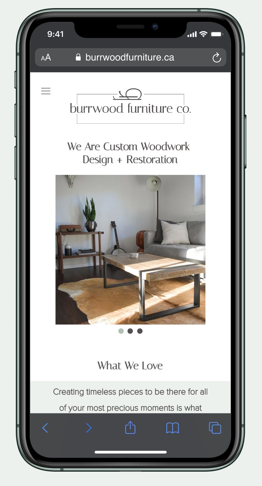
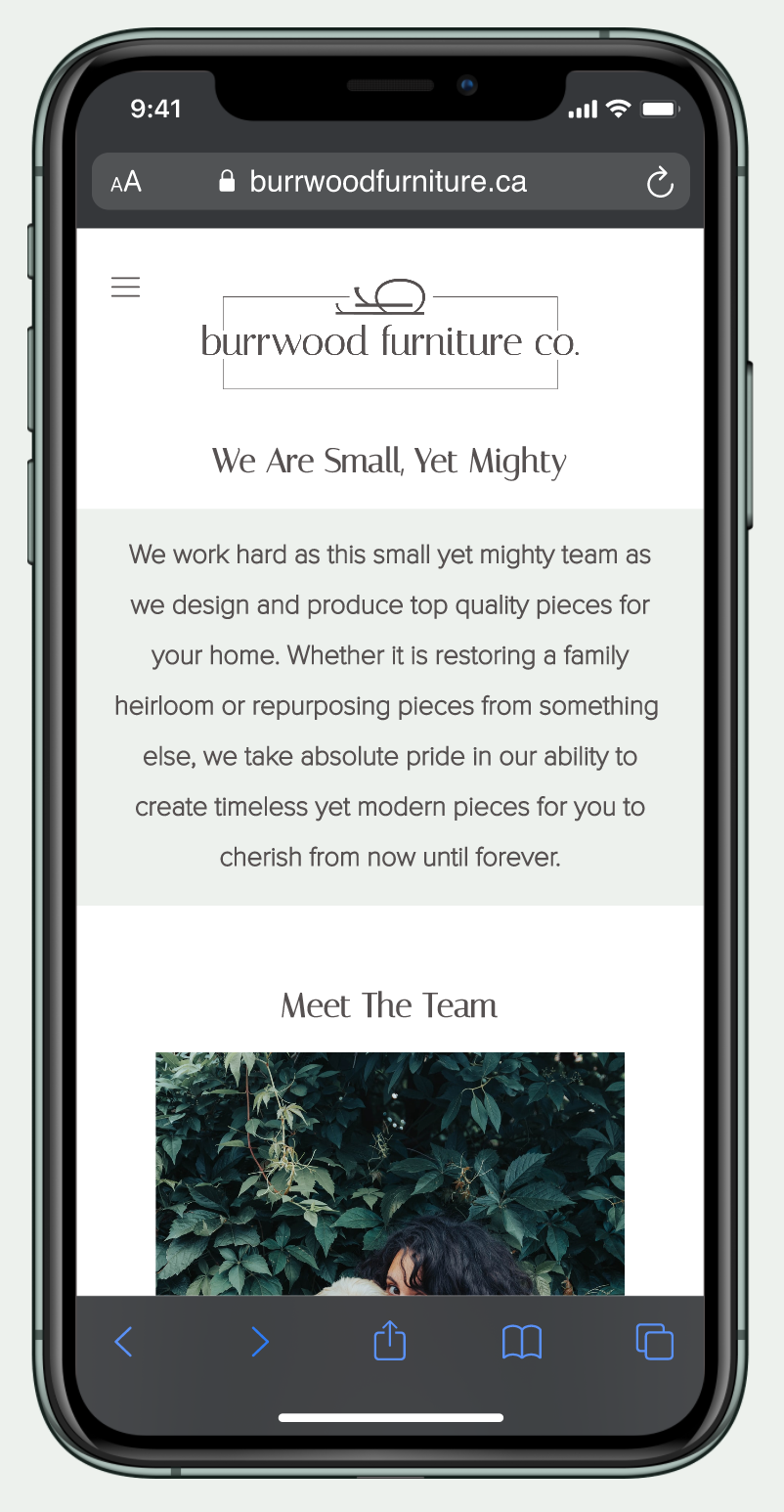

cellphone.
Once again, with this smaller format in mind, it is important to maintain enough space for the furniture pieces/photographs to speak for themselves. The product is the brand and allowing the designs to express that in the digital realm is of highest importance to gain new clients. So here we maintained that philosophy when re-organizing the content.
motion graphic
all photographs were sourced from Unsplash